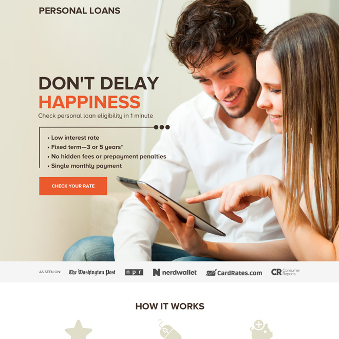
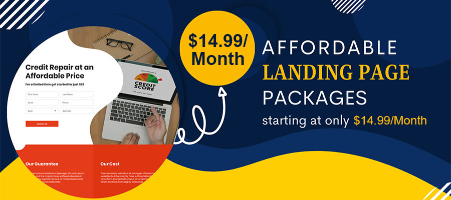
Basic Elements to Create a High-Converting Landing Page
Are you struggling to get visitors to take action on your website? Whether you’re trying to increase sales, generate leads, or grow your email list, a high-converting landing page can help you achieve your goals. In this ultimate guide, we’ll show you how to craft a landing page that drives conversions and delivers results.
Define Your Goal and Audience
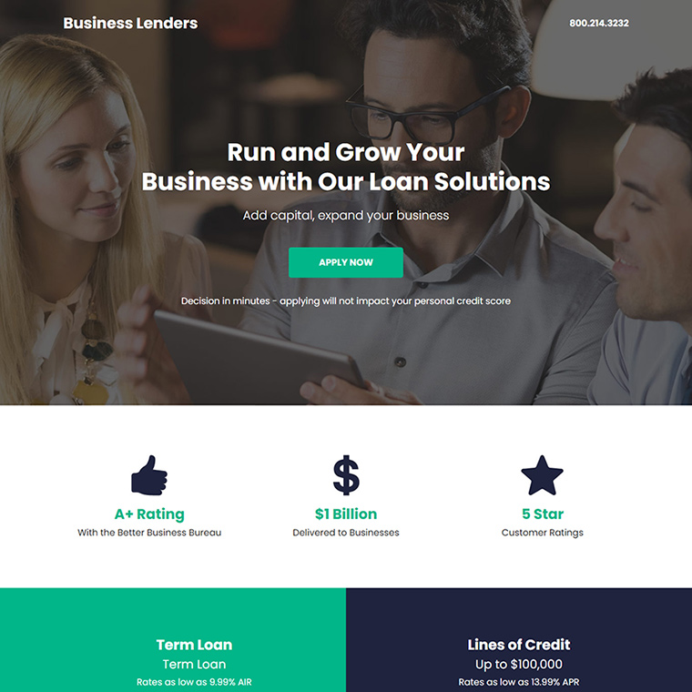
To create an effective landing page, it is crucial to start by defining your objective and target audience. The primary question you need to ask yourself is: what do you want visitors to accomplish after visiting your landing page? Whether it’s making a purchase, subscribing to a newsletter, filling out a form, or signing up for a free trial, you need to have a clear goal in mind.
Once you have defined your goal, the next step is to understand your target audience. Who are you trying to reach with your landing page? What are their characteristics, demographics, interests, and pain points? Understanding your audience’s needs, wants, and motivations is critical to creating a landing page that speaks to them and addresses their concerns.
To get a deeper understanding of your audience, you can conduct market research, analyze your website’s analytics data, and create customer personas. Customer personas are fictional representations of your ideal customers that are based on real data and insights. By creating these personas, you can better understand your audience’s pain points, preferences, and behaviors and tailor your landing page accordingly.
In conclusion, defining your goal and audience is the first step to creating a landing page that converts. By knowing what you want visitors to accomplish and understanding your target audience’s needs and motivations, you can create a landing page that resonates with them and increases the likelihood of achieving your desired outcome.
Craft a Compelling Headline
Crafting a compelling headline is a critical component of creating a high-converting landing page. Your headline is the first impression visitors have of your page, and it needs to grab their attention and persuade them to keep reading. A well-crafted headline should be clear, concise, and highlight the benefits of your offer.
To create a compelling headline, start by focusing on your offer’s key benefits. Ask yourself, what problem does your offer solve for your target audience, and how will they benefit from it? Your headline should emphasize these benefits and communicate them clearly and concisely.
Using strong, action-oriented words can also help make your headline more compelling. Use words that evoke emotion and urgency, such as “discover,” “transform,” “unleash,” or “now.” These words can create a sense of excitement and encourage visitors to take action.
It’s important to note that your headline should accurately reflect the content of your landing page. Misleading or clickbait-style headlines may initially grab visitors’ attention, but they will quickly lose interest if they feel misled or deceived. Be truthful and transparent in your headline, and you’ll build trust with your visitors.
Finally, it’s a good idea to test different headlines to see which one resonates best with your target audience. A/B testing is a common method used by marketers to compare two different versions of a landing page and see which one performs better. By testing different headlines, you can find the one that is most effective in converting visitors into customers.
In conclusion, crafting a compelling headline is an essential part of creating a high-converting landing page. By focusing on the benefits of your offer, using strong action-oriented words, being truthful and transparent, and testing different versions, you can create a headline that grabs visitors’ attention and entices them to keep reading.
Write Persuasive Copy
Writing persuasive copy is crucial to creating a landing page that converts visitors into customers. Your landing page copy should be informative, persuasive, and focused on the benefits of your offer. To create persuasive copy, there are several key strategies you can use.
It’s essential to focus on the benefits of your offer, rather than just the features. Explain how your offer solves your target audience’s problem and improves their life. Use specific examples and testimonials to demonstrate how your offer has helped others achieve their goals.
Use bullet points, subheadings, and bold text to break up your copy and make it easy to scan. Most visitors will skim your landing page rather than reading it in its entirety, so it’s essential to use formatting to highlight key points and benefits.
Keep your language simple and avoid using industry jargon or buzzwords. Speak in a language that your target audience understands and can relate to. Avoid using technical terms that may confuse or intimidate visitors.
Use social proof to build trust and credibility. Testimonials, reviews, and endorsements from satisfied customers can be powerful tools in persuading visitors to take action. Use social proof strategically throughout your landing page to reinforce the benefits of your offer and the reliability of your brand.
It’s essential to create a sense of urgency in your copy. Encourage visitors to act quickly by emphasizing limited-time offers, low stock levels, or impending deadlines. This can create a sense of urgency and encourage visitors to take action before it’s too late.
In conclusion, writing persuasive copy is an essential part of creating a high-converting landing page. By focusing on the benefits of your offer, using formatting to make your copy easy to scan, using simple language, using social proof to build trust, and creating a sense of urgency, you can create copy that persuades visitors to take action and convert into customers.
Use High-Quality Images and Videos
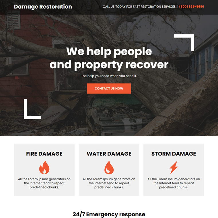
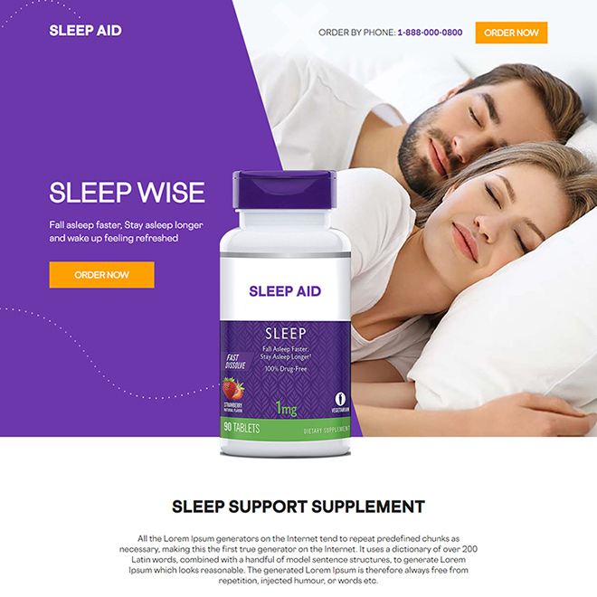
Using high-quality images and videos can make a significant impact on the effectiveness of your landing page. Visuals help to capture visitors’ attention, convey information quickly, and create a sense of engagement. To use visuals effectively, it’s essential to use high-quality images and videos that showcase your product or service in action.
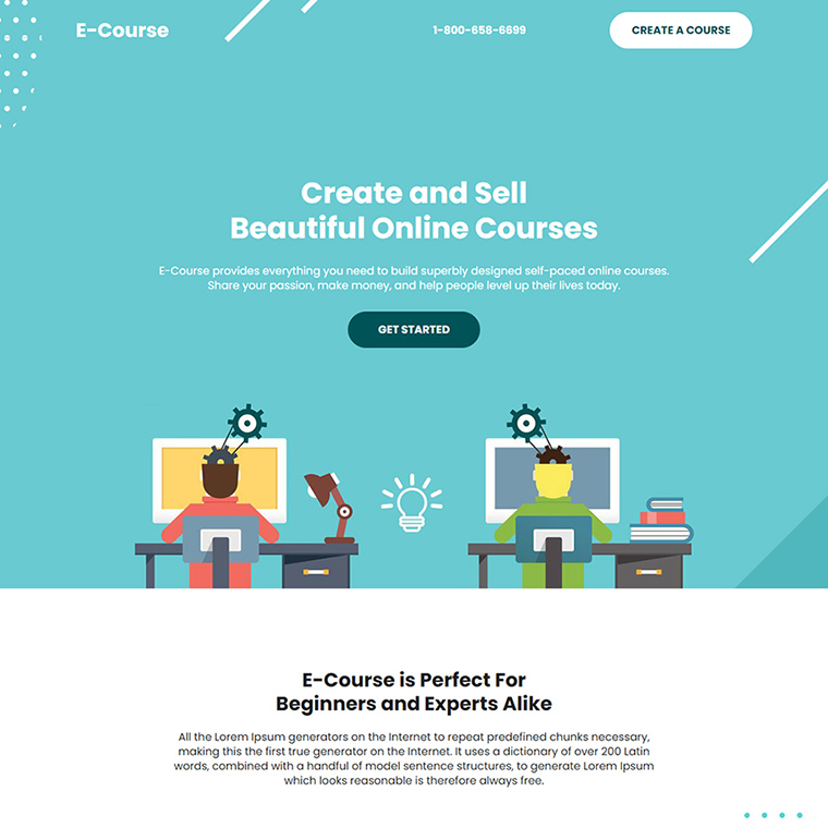
First, make sure that the visuals you use are relevant to your offer and support your message. Your visuals should help to communicate the benefits of your offer and provide additional context to your copy. For example, if you’re promoting a software tool, consider using screenshots or videos that show the tool in action and highlight its key features.
Use high-quality visuals that are visually appealing and professional. Low-quality or poorly designed visuals can detract from your landing page’s effectiveness and make your brand appear unprofessional. If you don’t have access to high-quality images or videos, consider hiring a professional photographer or videographer to help create the visuals you need.
Consider using different types of visuals to create variety and engagement. For example, you could use a combination of images, videos, infographics, or animations to help illustrate your offer and make your landing page more engaging. Be sure to use visuals in a way that enhances your message rather than detracts from it.
Optimize your visuals for page speed and load times. Large images or videos can slow down your landing page’s load time, which can negatively impact your conversion rates. Be sure to compress your images and videos and use a content delivery network (CDN) to help speed up load times.
Using high-quality images and videos is a crucial element of creating a high-converting landing page. By using visuals that are relevant to your offer, visually appealing, varied, and optimized for load times, you can create a landing page that engages visitors, communicates your message effectively, and persuades them to take action.
Include Social Proof
Social proof is a powerful tool for building trust and credibility with your audience. When visitors see that others have benefited from your offer, they are more likely to trust your brand and consider making a purchase. There are several ways you can incorporate social proof into your landing page.
Consider using customer testimonials. Testimonials are a powerful way to showcase the benefits of your offer and demonstrate how it’s helped others. When using testimonials, be sure to include specific details about how your offer helped the customer, such as increased sales or improved productivity. Use quotes from customers that are detailed and specific to create the most impact.
Use case studies to demonstrate the effectiveness of your offer. Case studies provide detailed examples of how your offer helped a customer overcome a specific challenge or achieve a particular goal. Use case studies that are relevant to your target audience and highlight the key benefits of your offer.
Include reviews from third-party websites, such as Google Reviews or Yelp. These reviews provide an unbiased view of your brand and can help to build trust with visitors who may not be familiar with your business.
Use social media to showcase customer feedback and user-generated content. Social media posts, tweets, and images from satisfied customers can be a powerful way to demonstrate the benefits of your offer and build trust with your audience.
Incorporating social proof into your landing page is an essential element of creating a high-converting page. By using customer testimonials, case studies, reviews, and social media, you can demonstrate the effectiveness of your offer, build trust with your audience, and persuade visitors to take action.
Add a Strong Call-to-Action (CTA)
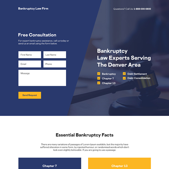
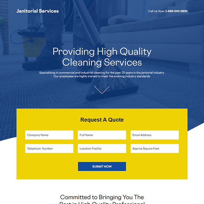
Your call-to-action (CTA) is the most crucial element of your landing page because it’s the final push to get visitors to take action. It’s essential to make your CTA clear, compelling, and easy to find.
Here are some tips for creating a strong CTA:
First, use action-oriented language. Your CTA should use verbs that create a sense of urgency and motivate visitors to take action. Use phrases like “Download Now,” “Sign Up Today,” or “Get Started” to make your CTA more compelling.
Use contrasting colors to make your CTA stand out. Your CTA should be easily distinguishable from the rest of your landing page, so visitors can quickly find it. Use a color that contrasts with the rest of your page to make your CTA stand out.
Create a sense of urgency. Use phrases like “Limited Time Offer” or “Act Now” to create a sense of urgency and encourage visitors to take action. You can also use a countdown timer or a limited number of spots available to create a sense of urgency.
Make sure your CTA is easy to find. Your CTA should be prominently displayed on your landing page, so visitors can easily find it. Consider placing it above the fold, so visitors don’t have to scroll to find it.
Test your CTA to see what works best. A/B testing can help you determine the best color, language, and placement for your CTA. By testing different variations, you can optimize your CTA to improve your conversion rates.
Your CTA is the final push to get visitors to take action on your landing page. By using action-oriented language, contrasting colors, creating a sense of urgency, making your CTA easy to find, and testing different variations, you can create a strong CTA that improves your conversion rates.
Optimize for Conversion
Optimizing your landing page for conversion is a continuous process that involves testing and refining your page to improve its effectiveness.
Here are some tips for optimizing your landing page:
- Use A/B testing to try out different variations of your landing page elements. Test different headlines, copy, visuals, and CTAs to see what resonates with your audience.
- Make data-driven decisions based on your A/B testing results. Use analytics tools to track your conversion rates, bounce rates, and other metrics to identify areas for improvement.
- Focus on your page load speed. Slow load times can cause visitors to abandon your page, so make sure your page loads quickly.
- Simplify your form fields. Only ask for essential information in your form fields to reduce friction and improve your conversion rates.
- Optimize your page for mobile devices. More and more people are browsing the web on their mobile devices, so make sure your landing page is mobile-friendly.
- Remove distractions. Remove anything that might distract visitors from your offer, such as links to other pages or social media icons.
- Continuously test and refine your landing page to improve its effectiveness. Use the insights you gain from your A/B testing to make data-driven decisions and optimize your page over time.
Optimizing your landing page for conversion is a continuous process that involves testing, refining, and making data-driven decisions. By following these tips, you can create a high-converting landing page that delivers results for your business.
